Mirko Tobias Schäfer / Assistant Professor
University of Utrecht Department for Media and Culture Studies
Mirko Tobias Schäfer / Assistant Professor
University of Utrecht Department for Media and Culture Studies
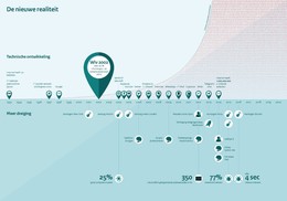
Dubbed as “Infographic about technological development and increasing disorder” [sic!], the image shows to parts, a top and a bottom part divided by a timeline. The upper part “technological development” indicates randomly various technological milestones: “1993 First search engine, Lycos”, “2004: World of Warcraft”, “2005 YouTube”, “2007 Dropbox and first iPhone” and so forth. An exponential curve ascends to the top right corner of the image depicting zeros and ones. There is no scale or anything that would refer to actual data that might have informed this graphical element. It just seems to suggest that an avalanche of zeros and ones is emerging and constituting an unspecified threat. To tie this narrative to threats, the bottom part of the infographic lists in similar fashion a random selection of violent incidents, depicted with a bomb as icon: “2001 attacks in New York”, “2004 attack Madrid”, “2005 attack metro London”. It also features a category listing the Netherlands’ participation in military missions, of course only the official missions not the covert ones. One icon is supposed to represent a Jihadi warrior and indicates activities in the Middle East: “2012 massive departures to Syria” again unsupported by any actual figures. The image constitutes a correlation between the increasing zeros and ones in the top part of the infographic and the alleged increase of terrorist attacks, military missions, the increase of malware, and cyber-attacks which are also depicted in the bottom part.
With reference to Helen Kennedy’s work on data literacy, we look at five elements in this infographic, which help us to come to an assessment. The five elements are: the data, the data source, axes and scales, the key and the title.
Data: there are almost no data to find in this infographic; there is an indication of a 25% “growth of computer viruses” in 2004 and of 77% “increase malware” in 2014, but it is unclear in relation to what or which period. These figures make even less sense as the infographic seems to make a distinction between malware and computer viruses. There is an indication of 350 registered cyber-attacks in 2012, but again those figures are not informative as we do not know how many attacks have been registered in other years, or if they have been registered at all.
Data source: there is no reference to the source of the data or information depicted in this infographic. Readers cannot verify any of the claims made. Referencing the data source or even providing access to the dataset used for making the infographic has become standard practice at leading journalist platforms such as The Guardian, the New York Times, the Washington Post, Die Zeit and many others. The government of the Netherlands who commissioned the infographic fails to reference any data source.
Axes and scales: there is one axis in this infographic, the timeline dividing the top and bottom part of the image. Scales are not indicated especially where it would matter, in the exponential curve of increasing ones and zeros in the upper right section of the image. Corresponding with this exponential curve in the upper part of the image, is a graphical element in the bottom part, a blueish curve indicating an increase (of disorder?) since 1993. There is no way for the reader to comprehend the alleged increase of technological development and disorder as there is no quantification provided through scales or axes.
Key: the infographic provides no key to learn more about the different shapes and colours used in this infographic.
Title: there are two titles for this infographic. On the website of the Rijksoverheid it is called “Infographic about the technological development and disorder in the world”. It also states that “this infographic illustrates the technological development and the increase of disturbance in the world since the Law for Intelligence and Security Services took effect in 2002. The infographic itself displays the title: "The New Reality".
Actually, all five key elements of this infographic are flawed, missing or incomplete. Needed information is not provided; standard practices of data visualizations are neglected, there are no scales, no reference to data sources and almost no data. The depicted events of technological development and political disorder are highly selective and most importantly incomplete. The main problem with this infographic are the spurious correlations. A spurious correlation claims a causality between two different events that are actually not related. Online one can find plenty of humorous spurious correlations connecting e.g. Nicolas Cage appearances in films to people drowned in pools or the US spending on science and suicides.
This infographic does something similar. It claims a causal relationship between technology development and terror threat through manipulative graphic design and selective choice of events and context. This starts with the title, that already suggests that technological development is related to “disorder in the world”; this is consequently supported by the depiction of an increase of technological inventions in the top part of the image corresponding with an increase of “disorder” in the bottom part.
David Korteweg, researcher at Bits of Freedom, has pointed this out in a critical review of this infographic. Graphic designer Ruben Pater appropriated this infographic by adding additional context and scales. Expanding the time frame puts the development in historical context and indicates that Europe saw significantly more terrorist activity prior to the invention of the internet and social media. Also the number of casualties due to terror attacks has been significantly higher in the 1960s and 1970s than today.
In conclusion one can only assume that this infographic has been designed solely for manipulating opinion forming on the controversial sleepwet.
Image: Rijksoverheid
Date March 2018 Category News
As the campaign for the referendum on the so-called dragnet (sleepwet), the law for the intelligence and security services, is in full swing, it might be worth to have a look at the infographic used by the government to communicate the need for the amended law.